

As a student, choosing a college is a significant decision that has a lifelong impact, personally and professionally. Many factors come into play: the campus experience, available academic programs, cost, sports and athletic opportunities, residences, and word-of-mouth referrals.
Once a selection is made and the student enrolls, many of these same factors will also determine how students perceive their college experience. Living conditions, their roommate, how they finance their education, the groups they’re involved in, and the friends they meet, all shape student success—and that’s a perennial challenge for administrators charged with improving retention rates.
Uncovering retention insights with big data
As vice president for academic administration at Gannon University in Erie, Pennsylvania, making sense of the vast array of data that we know about students is critical to our objective of closing the student retention gap and developing programs that provide encouragement, coaching, and advice to those who exhibit the earliest signs of dropout risk.
But, tracking a student’s engagement, academic record, and financial status is an intricate and complex task. Following numbers on a spreadsheet is manageable if you’re tracking a single factor, such as academic scores, but when multiple factors come into play, insights are hard to glean.
Gannon’s philosophy is that we want each student to be successful. Retention metrics are important, and ours have always been comparable with our peers, but several years ago we decided that’s not good enough. We constantly strive to deliver a memorable and successful university experience for each student. Data is key to helping us achieve that mission, but we knew that to truly understand the reasons students leave our school, we needed to find a way to visualize that data in more useful, comprehensive contexts than a spreadsheet or other systems allow.
With this in mind, we set about developing a predictive model using a pioneering technology known as glyphs.
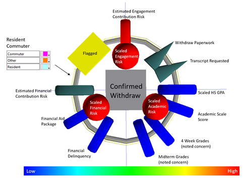
Predicting student retention with glyphs
Glyph-based data visualization is based on two decades of research into how the mind works to understand the world around it. Instead of looking at a field in a spreadsheet or a static chart, glyphs are a visualization of all the data available on a student including financial aid, recruiting, admissions, academic, and extracurricular data within a single multi-dimensional, interactive view. A combination of color-coded shapes, of varying sizes, gives us a full picture so we can clearly see retention risks and discover new insights.
Using glyphs, we have been able to enhance our analysis and find answers that inform student success programs more quickly, easily, and effectively. The insights reinforced what we already supposed, that three key factors heavily influenced student success: engagement, financial aid, and academic data. Using the power of visuals, and weaving in other variables such as attendance at events, involvement in clubs, work study, etc., we rapidly discovered previously unknown behavioral factors that indicate student risk. For example, early on our glyph data revealed that commuter students tended to be less engaged than on-campus students.
Further insights revealed that students who skip orientation meetings are less successful than those who attend the meetings. We could also zoom in on the financial status as a risk factor and pinpoint students who may be struggling using data based on registration hold reports.
Data-driven interventions
With all of this data-driven insight, we’ve been able to inform additional student success programs. For example, the establishment of a commuter lounge was an early initiative to encourage fellowship between commuter students and provide a place to take advantage of advisory services. To drive engagement, we’ve also added new club, sports, and travel experiences and funded departmental engagement events. Orientation events are now mandatory. And, we’ve created a network of advisors across campus to aid us in reaching out to those students we identify as at-risk, providing an invaluable one-on-one resource.
Financial factors are being tackled with initiatives such as lessening reliance on costly textbooks in classrooms, thereby easing the burden for those who struggle financially.
Glyphs also give us the power to add geo-location data and other variables to the mix so that we can assess the impact that other factors, such as residence halls, have on student wellbeing.
One thing we noticed early on is that our data insights are only as good as the data we capture. So, we’ve stepped up our efforts to track student involvement in other ways, such as introducing swipe cards at events. Now we can learn more about which specific extracurricular experiences engage students the most.
Measurable impact
By combining glyph-based data analysis with initiatives like these we’ve seen measurable success. In just one year, student retention increased by five percent, the equivalent of $2 million in tuition revenue over a four-year period.
Ultimately, this data-visualization revolution translates to lifelong success for our students. Glyphs were an integral part of identifying those students and helping them to stay in school. Using the power of data visualization to glean big-picture answers as to which students are vulnerable to attrition and why has been transformative to our intervention programs and other student-engagement initiatives.

Dr. Steven A. Mauro is vice president of academic administration at Gannon University in Pennsylvania. He is also an adjunct lecturer in the biology department and for academic support programs.